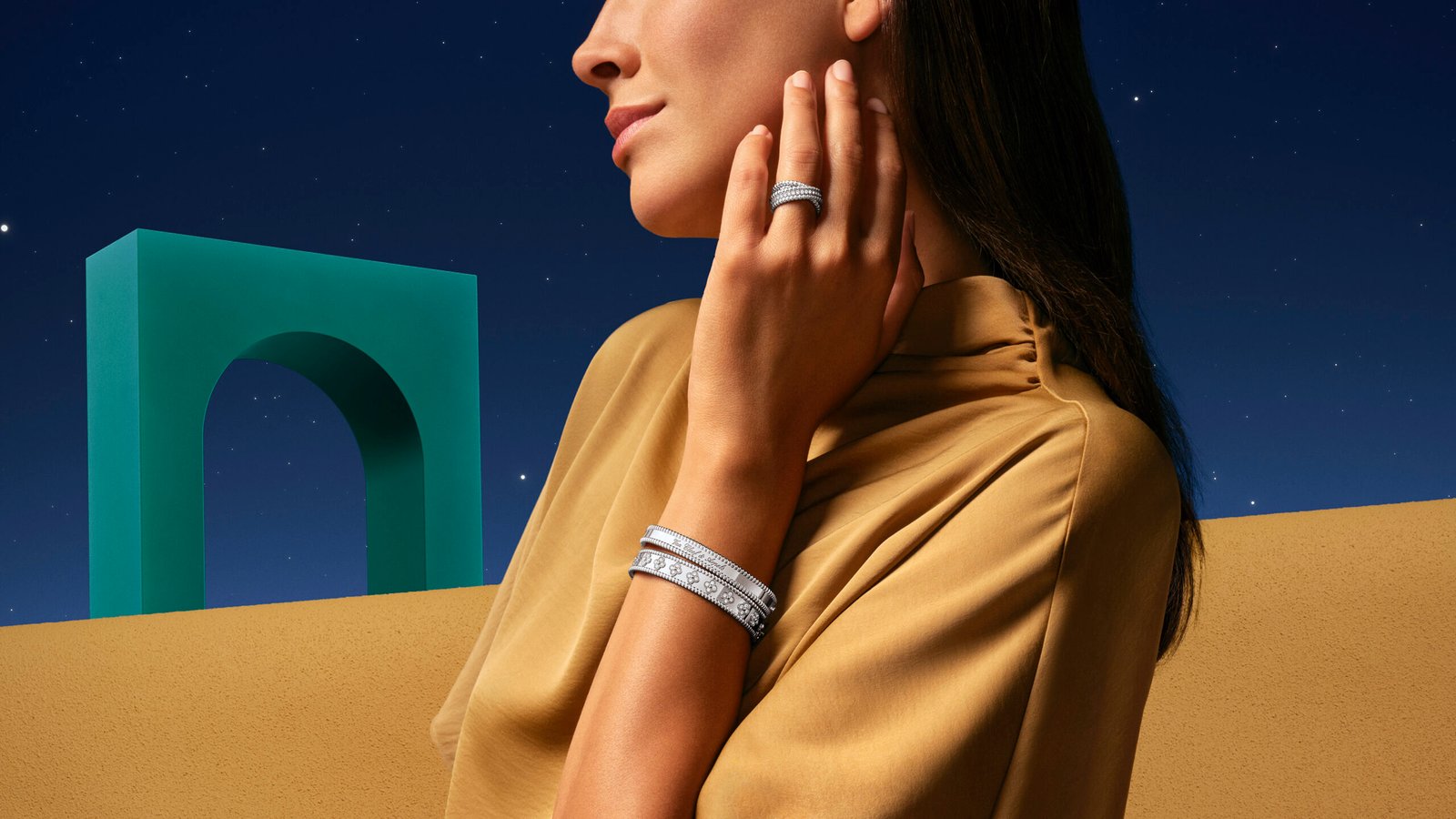
One of high jewelry’s most poetic houses, Van Cleef & Arpels has built its identity through masterful design codes. It is a brand that’s always understood something essential about ritual: that repetition carries meaning. For Ramadan 2026, the maison unveils a subtle dialogue between French high jewelry tradition and Arab artistic heritage. To do so, it returns to one of its quietest yet most enduring design codes: Perlée.
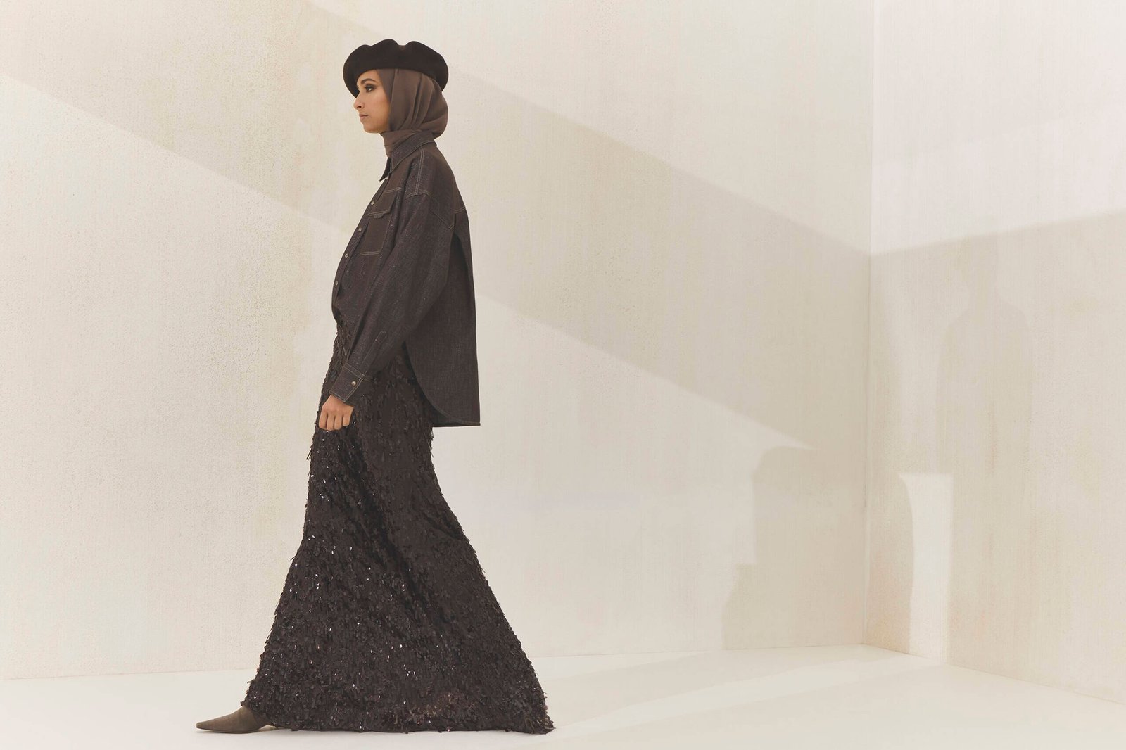
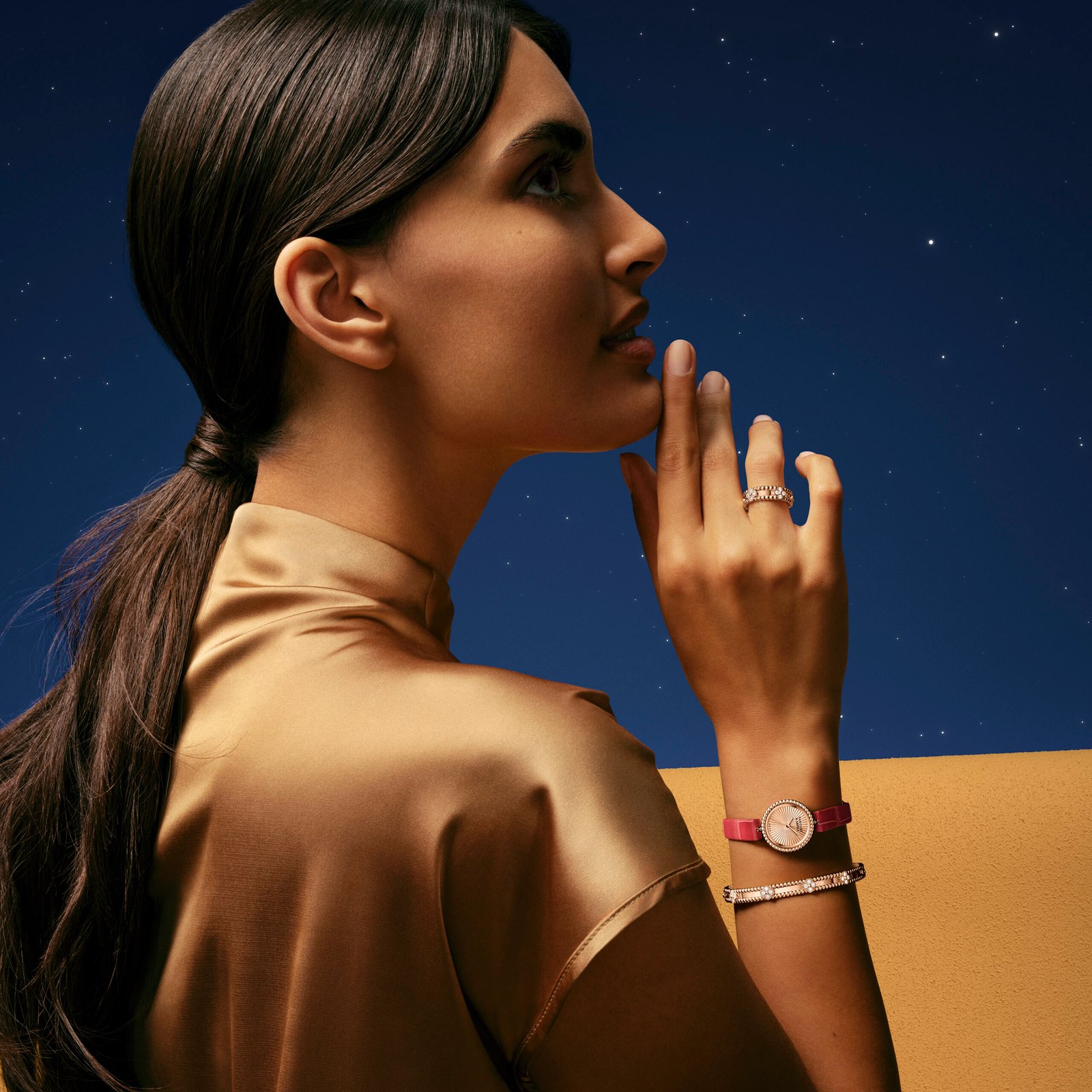
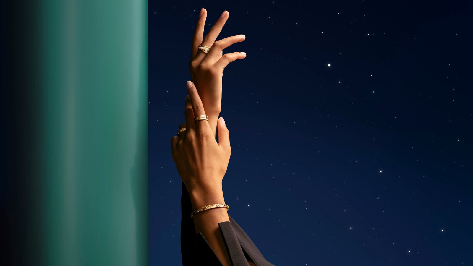
The Perlée collection is built around the golden bead – a simple, rounded form that traces back through Van Cleef’s archives to the late 1940s. Seen in early Couscous and Bagatelle creations, the bead motif became a way to introduce rhythm into metal. It softens structure. It adds tactility. It moves light. Unlike gemstone-led collections that command immediate attention, Perlée operates differently. The golden beads line bracelets, rings, earrings, and watches in yellow, rose, and white gold sometimes punctuated with diamonds, sometimes framing hard stones like turquoise, coral, or green malachite. The repetition of the bead creates a visual cadence almost architectural in its symmetry. For Ramadan, this repetition takes on deeper symbolism. Beads imply continuity. Cycles. The marking of time. And during a month defined by reflection and renewal, the circularity of the motif feels deliberate.
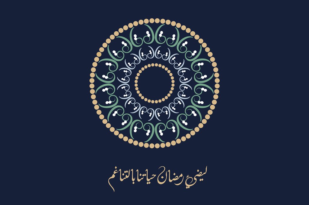
This year, Van Cleef & Arpels elevates Perlée further through a collaboration with artist Khalid Shahin. Rather than treating the campaign as purely commercial, the Maison introduces a calligraphic artwork inspired by the Arabic letter “Ta” (ت). The composition forms a circular meditation unity expressed through repetition. Shahin’s work mirrors the Perlée aesthetic: rhythm through structure, balance through repetition. The golden beads echo the curvature of the calligraphic strokes. The collaboration feels thoughtful rather than decorative, an integration of cultural language rather than surface-level symbolism. But beyond campaign imagery, the strength of this release lies in the design evolution within Perlée itself.
The Perlée Diamonds creations layer diamond pavé between rows of polished gold beads, creating contrast between texture and luminosity. The diamonds are not oversized; they are integrated. The bead remains the hero. The Perlée Couleurs pieces introduce hard stones that appear almost suspended within golden frames. A single turquoise dome ring, bordered by beads, feels sculptural and graphic. Coral offers warmth, particularly resonant for Ramadan evenings where rich tones meet gold embroidery and silk. Malachite provides depth with its natural striations adding movement against the uniform bead pattern. What distinguishes Van Cleef’s approach is proportion. The beads are meticulously calibrated neither too large to dominate nor too delicate to disappear. This attention to scale is what transforms repetition into refinement. Each piece feels wearable yet elevated, capable of stacking or standing alone.
The Perlé watch designs extend this philosophy into timekeeping. A circular dial framed by gold beads transform functionality into ornament. Unlike heavily gem-set high jewelry watches, these pieces maintain clarity. Where some houses lean into overt gold symbolism, Van Cleef leans into craft. Where others amplify sparkle, Van Cleef amplifies structure. There is also something important about historical continuity here. The Maison has always been drawn to nature, luck, and movement , themes embedded in the Alhambra motif’s four-leaf clover and in transformable designs that adapt to the wearer. Perlée extends that lineage. In a region where jewellery carries generational meaning gifted at weddings, passed down through families, worn during sacred months, Perlée feels especially aligned.